The post Comic of the Week: “The Muppets Take the Marvel Universe” appeared first on G33K-HQ.
]]>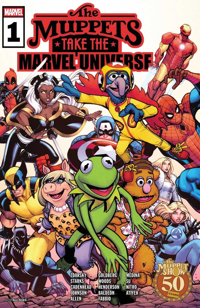
“The Muppets Take the Marvel Universe” is a collection of stories contributed by different writers and artists. They vary in length, but the longest one is “The Greatest Show (Not) On Earth,” written by Chip Zdarsky and illustrated by Pete Woods. This is the big team-up, where the Muppets must get the help of the Avengers (and other Marvel heroes) to rescue one of their cast from Mojo and his sinister streaming service, Mojo+.
One of the most important elements of this story is how well the characters from both universes interact, and what elements from Marvel and Muppets mesh. I’m happy to say that “The Greatest Show (Not) On Earth” absolutely nails it. As soon as Dr. Bunsen Honeydew brings his fellow Muppets to “The Interdimensional Council of Bunsens” (a clear reference to Marvel’s Interdimensional Council of Reeds), the crossover elements fall into place perfectly.
Chip Zdarsky finds excellent combinations of Marvel and Muppet characters to meet and interact with to give us the best gags and character moments alike. Howard the Duck creates a smooth transition from the Muppet animals to Marvel heroes, after which everyone finds a good counterpart. We get Fozzie Bear and Spider-Man teaming up for the wisecracks, Deadpool and Gonzo bonding over their shared weirdness, and Emma Frost finding a kindred spirit in Miss Piggy.
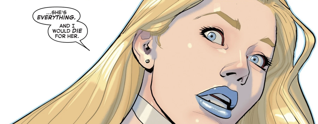
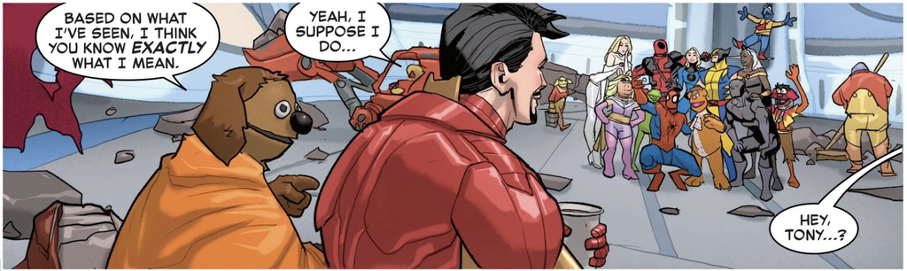
All the while, Zdarsky maintains strong voices for all of the characters, Muppet and Marvel alike, making their interactions feel natural and not making one outshine the other. Characters like Statler and Waldorf get to heckle, Sam the Eagle embraces Captain America’s patriotic attire, and even Iron Man and Rowlf get a good little heart-to-heart. The comic even has a good blend of Muppet Show comedy and Marvel Comics action, seamlessly transitioning without making either feel like an afterthought.
So yes, it is quite funny.

Pete Woods does a fantastic job with the artwork as well, making the Muppets fit in with the Marvel Universe without losing their distinct designs. While the Muppet characters maintain their puppet appearances, their body language and the way they’re framed in the panels make them properly emote and mesh with the Marvel superheroes. Of course, Woods also does a great job with the Marvel characters, capturing their iconic designs with a style that has just enough detail and color to make them stand out without contrasting their Muppet counterparts.
One of the best elements of Woods’ art style comes through in how he frames the characters within the panels and the angles he draws them from. Important moments can stand out more with nicely angled shots, like when we see Rowlf expertly play the piano from a slightly tilted view from above. Other moments receive equal thought and care, like the upward angle when we’re introduced to the Council of Bunsens that adds weight to the moment, or the splash panel where the Avengers burst through the Muppet Show banner.
Throughout the story, the colors are bright and clean, which helps bring the disparate character designs together and makes every page visually engaging. The Muppets, in their greens and pinks and blues, fit in naturally with the Avengers and their respective shades. When the colors shift, such as the darker corners in the Mojoverse, it helps subtly shift the mood and control the atmosphere to make key moments stand out all the more.
However, “The Greatest Show (Not) On Earth” is only part of “The Muppets Take the Marvel Universe,” so you might be wondering: do the other parts work just as well?

The other stories in “The Muppets Take the Marvel Universe” are shorter, coming in at five pages each. These provide opportunities to focus on individual characters meeting up, like Rocket and Groot meeting “Pigs in Space,” or Bruce Banner and Hank Pym making an appearance at Muppet Labs with Bunsen and Beaker.
Well, I’m happy to say that each of these stories is just as entertaining. While they’re more bite-sized stories, the writers and artists do a lot with the five pages they have.
“A Terrible Invention” (written by Kyle Starks, illustrated by Mike Henderson, and colored by Yen Nitro) brings the science sides of both worlds together, as doctors Banner and Pym discuss Bunsen’s disregard for both lab safety and Beaker’s personal safety. It’s filled with amusing dialogue from the exasperated scientists and ends with a great gag, including a fantastic full-page panel of… well, I won’t spoil it, but it works wonderfully.
“Pigs of the Galaxy” (written by MacKenzie Cadenhead, illustrated by David Baldeon, and colored by Yen Nitro) has the feel of a classic “Pigs in Space” sketch, complete with dramatic narration, bickering between the characters, and special guest stars Rocket and Groot. It’s pitch-perfect in story, pacing, and voice, making it feel like it was pulled straight from an episode of “The Muppet Show.”

“Bad Man” (written by Phillip Kennedy Johnson, illustrated by Athila Fabbio, and colored by Mike Atiyeh) is perhaps the most unique of the stories, featuring a nearly dialogue-free story where Wolverine meets Doctor Teeth and the Electric Mayhem Band. The lack of dialogue means the art has to do a lot to convey the narrative and control the pacing, but Fabbio’s artwork handles it nicely. This also has the most distinct art, leaning a little more to the cartoonish side than the others, but in doing so makes the characters more expressive in their faces and body language, so it sells the story all the better.
“Just What the Chef Ordered” has the largest creative team, with Ashley Allen and Chef Paul Carmichael on the story (but just Ashley credited for the script), Paco Medina as the artist, and Yen Nitro back on colors. This story has Doctor Strange trying to get a soup to help Clea recover from a sickness from the Dark Dimension, but the only person capable of cooking such a soup is the Swedish Chef. This is a comedic story that embraces the wackiness of the Chef and Marvel’s multiverse, filled with bright colors and strong lighting.
Finally, “Muppets Assemble!” (written by Adam F. Goldberg and illustrated by E.J. Su) is a short story with a simple but fun concept: what if the Muppets auditioned to be Avengers? This gives a chance for a few characters who didn’t get a chance to appear in earlier stories to appear, such as Lew Zealand and Pepe the King Prawn, as well as get a few more gags out of popular characters.
“The Muppets Take the Marvel Universe” is fun and full of love for both “The Muppet Show” and the Marvel Universe. The characters work together better than anyone could have expected, thanks to the top-tier work of the writers and art teams. Each story had its fair share of laugh out loud moments, and it’s clear from the detail that went into every element that the comic is a work of love from everyone on it.
Here’s to another 50 years of Muppets and Marvels alike.
The post Comic of the Week: “The Muppets Take the Marvel Universe” appeared first on G33K-HQ.
]]>The post The Biggest MCU News at SDCC 2026 appeared first on G33K-HQ.
]]>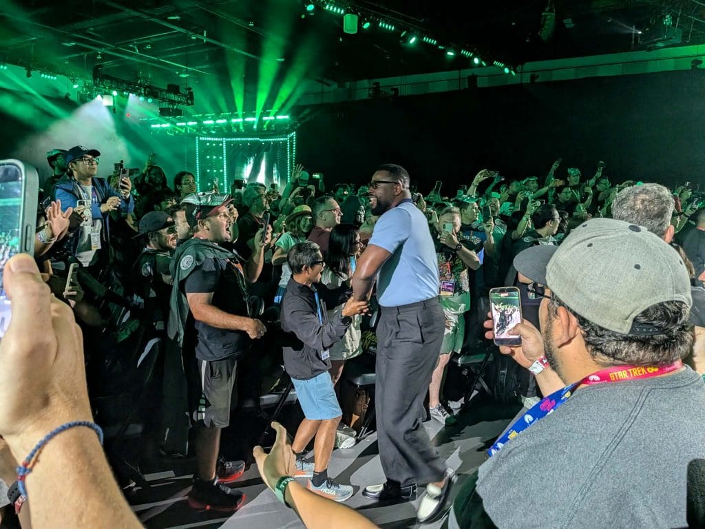
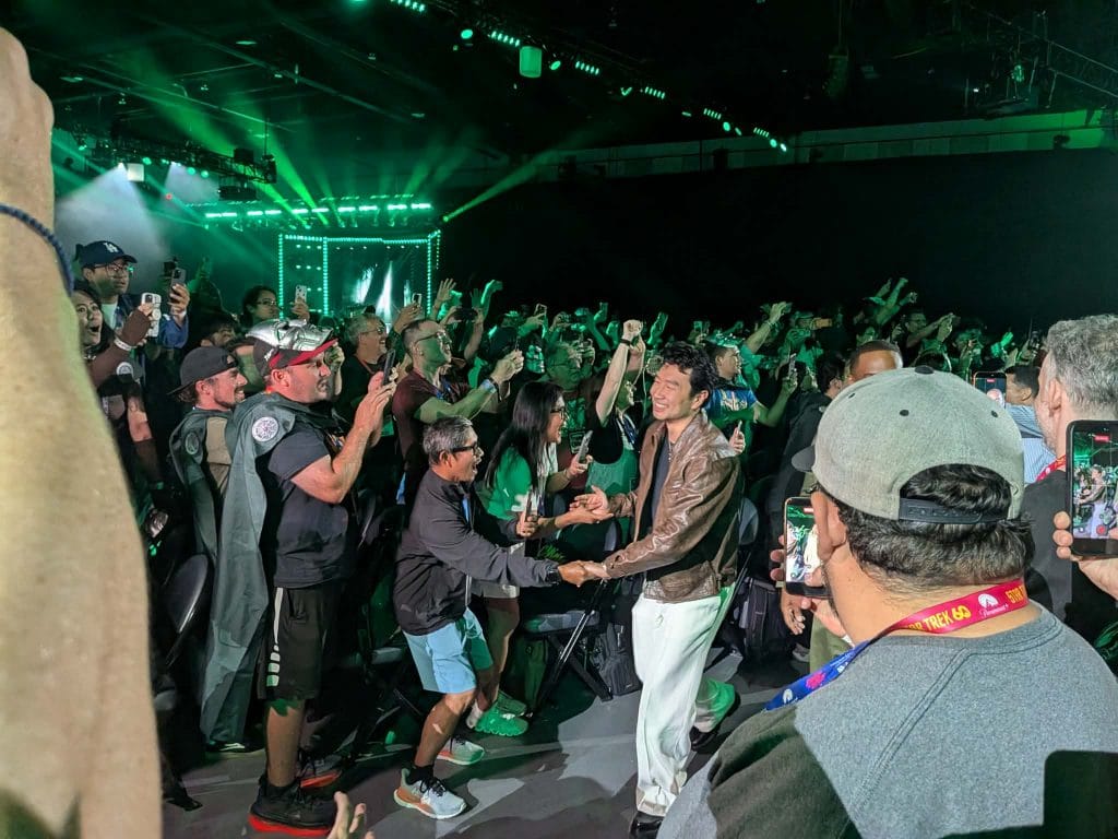
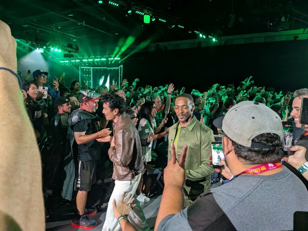
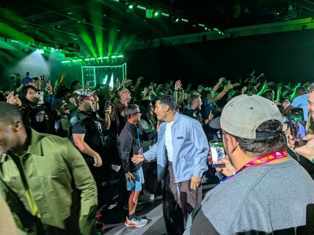
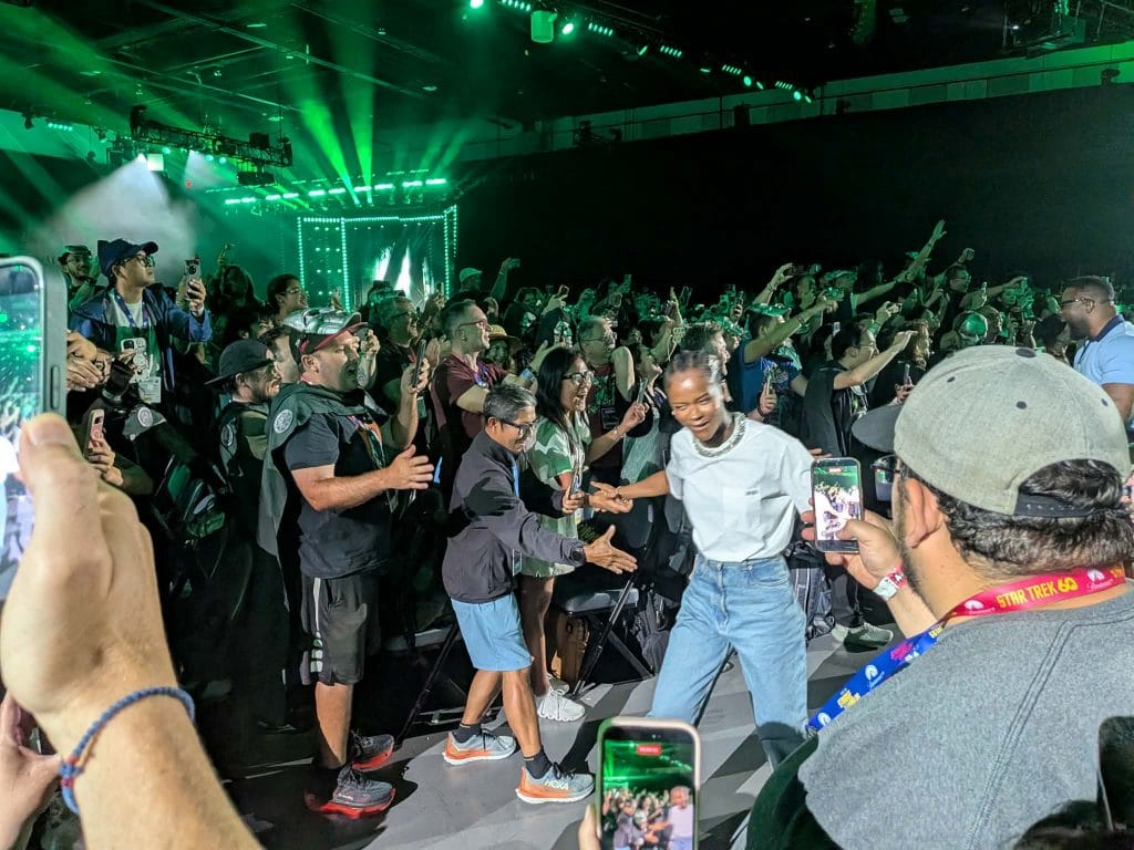
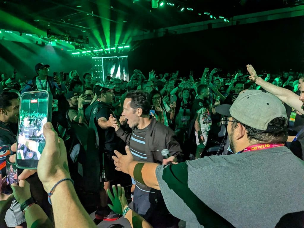
Marvel’s cast members meet the crowd at SDCC, photo by Jeremy Wilson
Avengers: Doomsday
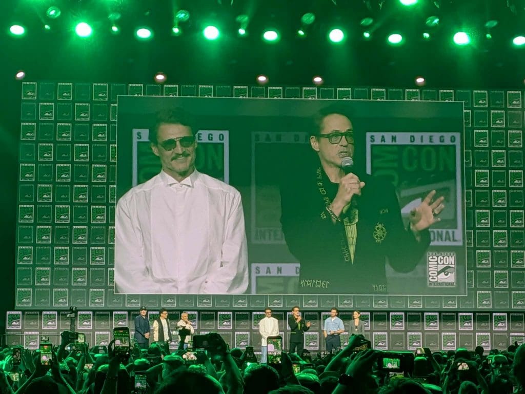
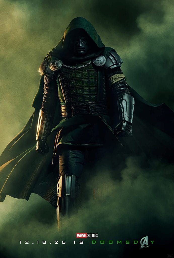
Doomsday is on its way, with more news about the upcoming movie following a recent trailer release. A few key details were revealed, including Hayley Atwell’s returning as Peggy Carter, alongside Chris Evans as Steve Rogers (although the extent of her role has not been revealed). Additionally, we learned that, like in the comics, Victor Von Doom and Reed Richards go way back.
We also got a new poster, showing how Doctor Doom will look in the movies:
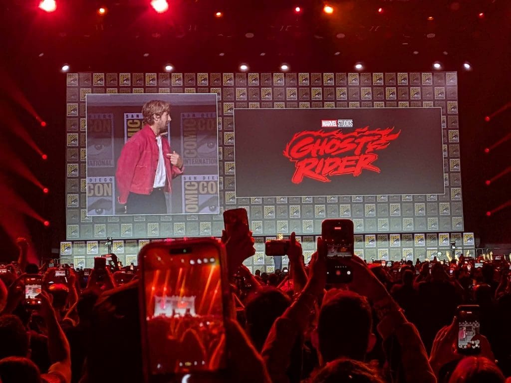
Ghost Rider
One of the first and biggest announcements is the return of Ghost Rider to the big screen. Ryan Gosling has been cast as the titular spirit of vengeance, with Shawn Levy (who previously directed Deadpool & Wolverine) directing. The movie will come out in 2028.
This isn’t Ghost Rider’s first time in theaters, or even as something MCU-adjacent. Nicholas Cage famously played Johnny Blaze back in 2007, with a sequel in 2011. In Marvel’s Agents of S.H.I.E.L.D., Gabriel Luna played the Robbie Reyes Ghost Rider, although considering the Marvel movies have never acknowledge Agents of S.H.I.E.L.D., that’s unlikely to be relevant.
Black Panther III
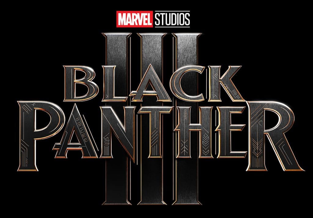
Marvel also announced Black Panther III, with Ryan Coogler returning to direct. The movie will feature David Jonsson, who will play the son of T’Challa. While not much else is know about the project yet, it’s set to hit theaters December 15, 2028.
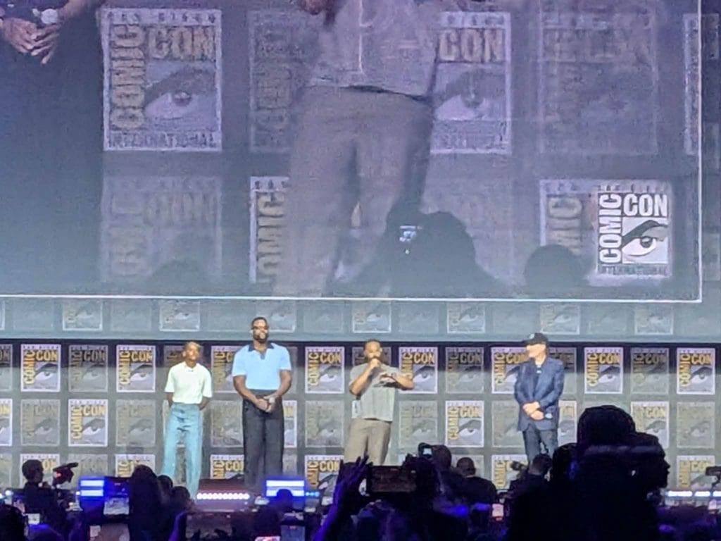
While the panel still left plenty of mysteries for upcoming projects, such as the future of the X-Men in the MCU, VisionQuest, or the next season of Daredevil: Born Again, it still gave Marvel fans plenty to look forward to.
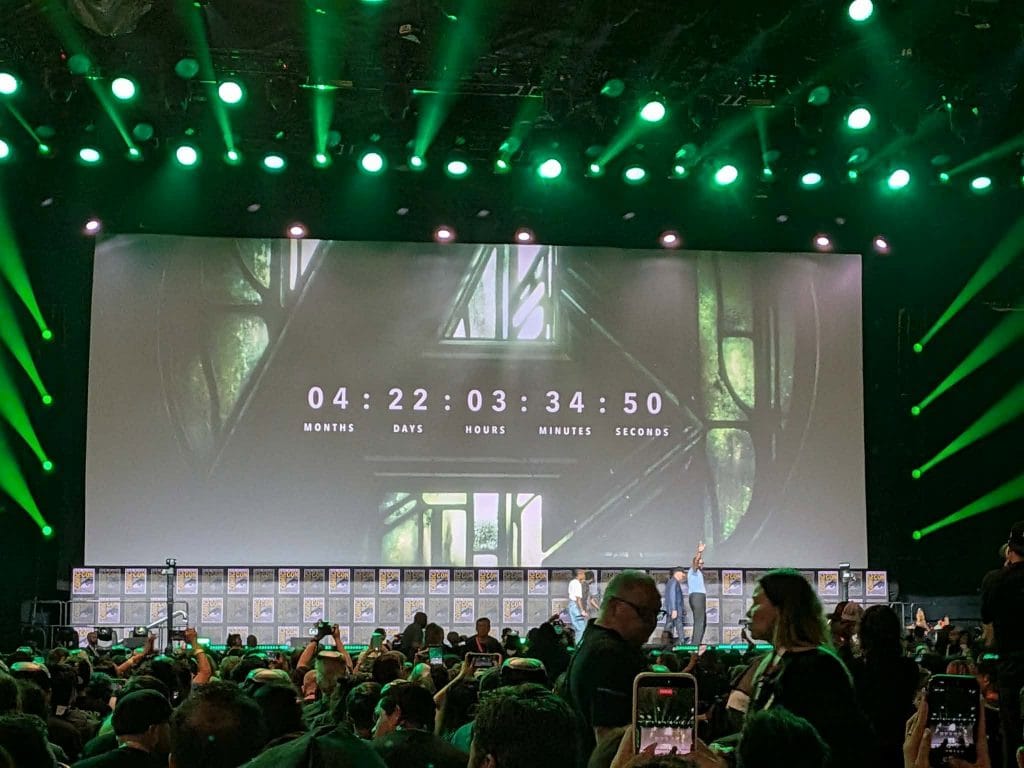
What are you the most excited about? Are you ready to see Ghost Rider return to the silver screen, or are you more looking forward to seeing Spider-Man next week? Let us know, and keep an eye on G33k-HQ for more news as it’s announced!
The post The Biggest MCU News at SDCC 2026 appeared first on G33K-HQ.
]]>The post “Avengers: Doomsday” Trailer Gives Us Our First Look at Doctor Doom appeared first on G33K-HQ.
]]>But you don’t want to read a long preamble talking about the trailer, you want to watch it. So here you go:

The trailer not only shows us our first glimpse of Doom as he faces off against Thor (Chris Hemsworth), whose narration describes him as a greater threat than any the Avengers have faced before, but it’s filled with glimpses at other characters and scenes to come.
We get the Fantastic Four meeting multiple characters, Gambit (Channing Tatum) fighting with Shang Chi (Simu Liu), Yelena (Florence Pugh) fighting the shape-shifting Mystique (Rebecca Romijn), Loki (Tom Hiddleston) with a TVA ID card in hand, and more.
And it leads to the return of Steve Rogers (Chris Evans), back from the past to help his friends and proving that he’s still worthy.
Along with the trailer, Marvel revealed a new poster, showcasing Doom as he stares upon a tapestry filled with potential foreshadowing:
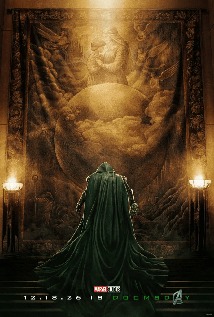
“Avengers: Doomsday” hits theaters December 18th, 2026. Check out the trailer and keep an eye on G33k-HQ for more nerdy news!
The post “Avengers: Doomsday” Trailer Gives Us Our First Look at Doctor Doom appeared first on G33K-HQ.
]]>The post Comic of the Week: “Marvel/DC: Spider-Man/Superman” #1 appeared first on G33K-HQ.
]]>
Marvel Comics and DC are teaming up again, with Spidey and Supes joining forces. While we missed the timing to include March’s “Superman/Spider-Man” team-up, this comic continues the crossovers, just with the order reversed on the title. So of course a cross-company team-up like this has to be our Comic of the Week.
“Spider-Man/Superman” is an anthology of team-up stories, so it’s written, illustrated, and colored by multiple creators. Among the credits are familiar names like Geoff Johns, Jason Aaron, Dan Slott, and Stephanie Phillips, to name a few writers, as well as artists like Humberto Ramos, Todd Nuack, and Sara Pichelli. Credit must also be given to the colorists, including Muntsa Vicente, Brad Anderson, Federico Blee, and Louise Simonson. There’s only one name consistent between each and every story, and that’s Joe Caramagna as the letterer.
So, with all those talented creators on the team, how is the comic?
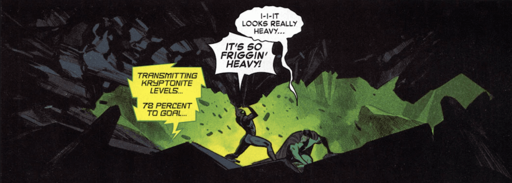
Each story in “Spider-Man/Superman” presents different scenarios where the characters meet, and gives them all chances to shine and showcase their personalities. The largest story has Brad Meltzer, Pepe Larraz, and Matthew Wilson on a team-up tale called “Our Kryptonite,” but others feature team-ups with Spider-Man Noir and the early version of Superman, Gwen Stacy and Lana Lang, Miles Morales and Superman, and even Jane Foster as Thor teaming up with Wonder Woman.
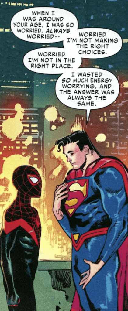
The details for each story differ from writer to writer, featuring different types of team-ups. We have Spider-Man and Superman trapped by villains and talking each other through it, Ghost Spider and Supergirl forming a rivalry, The Thing being inspired by Superman to do more than clobber, Steel and Thor meeting up, and more. Each one gives their respective characters an opportunity to show off their personalities and bounce off each other in ways we’d never get to see outside of this crossover, like Superman giving Miles Morales a pep talk, while highlighting each of their strengths.
The entries vary in length, with the longest being over 20 pages, and the shortest coming in at two. The writers and artists make full use of however much or little space they have, telling a satisfying story or snippet in each one.
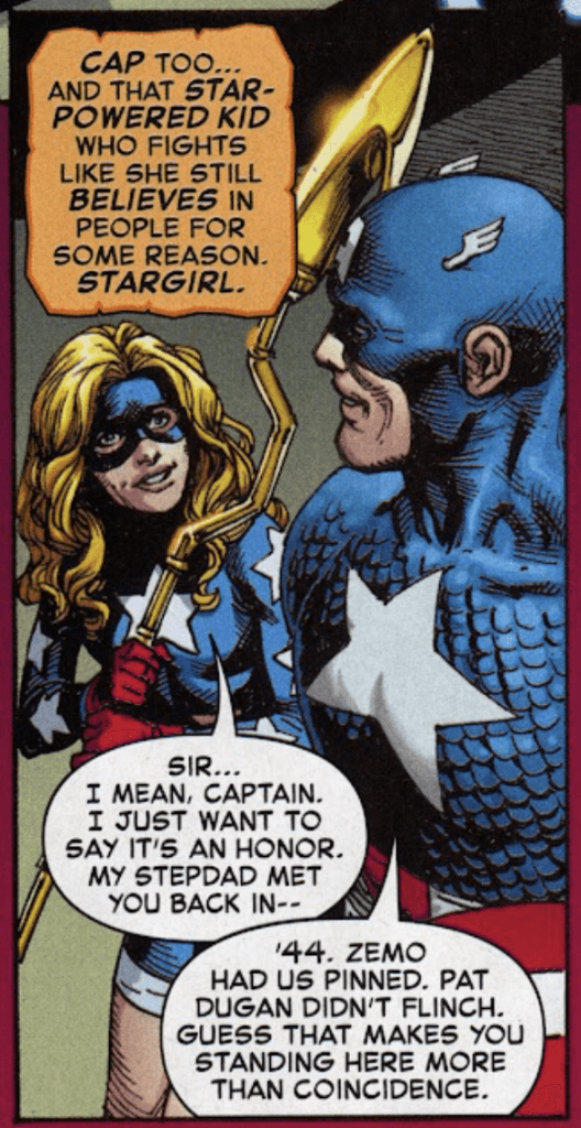
The key to this lies in the characters above all else, as the comic highlights what makes each of them timeless. Superman inspires. Spider-Man perseveres. Wonder Woman sees the good in everyone. The stories that capture these core elements hit the key emotional beats they need to showcase the characters and the love that the writers and artists hold for them. Some do it better than others, but overall the writers nail it more often than not.
By focusing on these central character traits, “Spider-Man/Superman” manages to tell multiple character-driven stories that carry emotion along with the action. Sure, seeing Superman breaking free of the Venom symbiote is cool, but it’s the conversation before that, where Superman and Spider-Man share what motivates them, that makes the story land. The balance of character dynamics and team-up action make the stories land, while focusing on the timeless elements of the heroes.
Each story also features a different artist, showcasing an array of styles. Pepe Larraz, Gary Frank, Todd Nauck, and Sara Pichelli are some particular stand-out artists, but credit must be given to all of them. The art styles tend to match the stories nicely, with artists that can bring out both the action and the emotional moments.
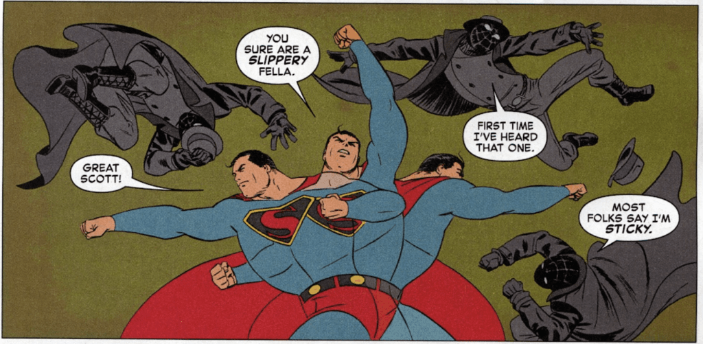
For instance, Marcos Martin and colorist Muntsa Vicente bring Dan Slott’s Spider-Man Noir/Superman story to live with a distinct style, utilizing bold designs that go light on the detail to make characters pop more while looking similar to older art styles that suit the time frame of the comic. Martin occasionally shapes the comic panels into letters to emphasize the sound effects, blending the diegetic sound with the framing of the comic to add a nice emphasis to the moment.
While opinions will vary about which story is best, and some work better than others, there’s a little something for everyone. Obviously, Spider-Man and Superman fans will get the most out of the comic, but it also takes the time to highlight other iconic characters. (Personally, my favorite story is “Our Kryptonite,” while my least favorite is the Ghost-Spider/Supergirl team-up “Remarkable,” but even my last pick still has plenty to appreciate.)
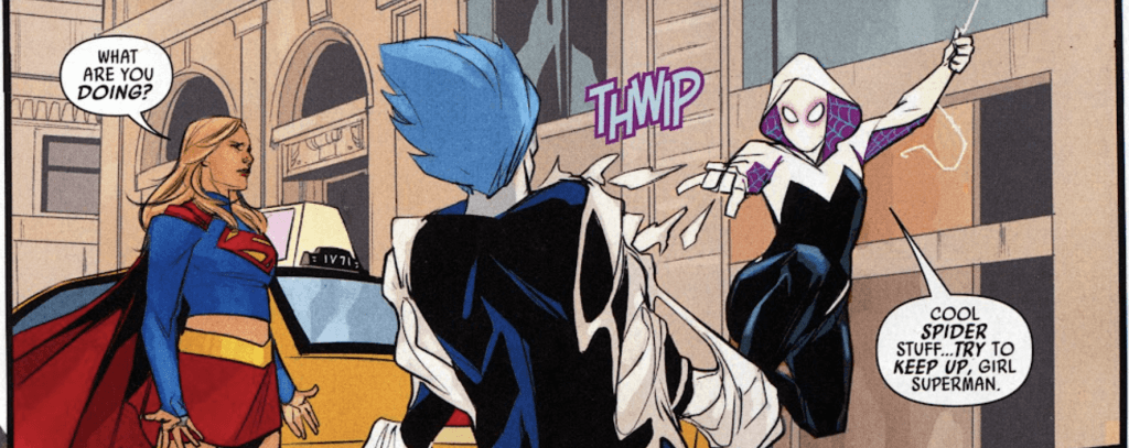
Overall, “Spider-Man/Superman” is a rare and welcome crossover. It features works of passion by creators that love the characters, and takes the time to focus on the elements that have made the characters timeless. If you’re a fan of either Superman or Spider-Man, or just want to get a Marvel/DC crossover for your collection, you’ll want to pick up this comic.
The post Comic of the Week: “Marvel/DC: Spider-Man/Superman” #1 appeared first on G33K-HQ.
]]>The post Comic of the Week: “Uncanny X-Men” #22 appeared first on G33K-HQ.
]]>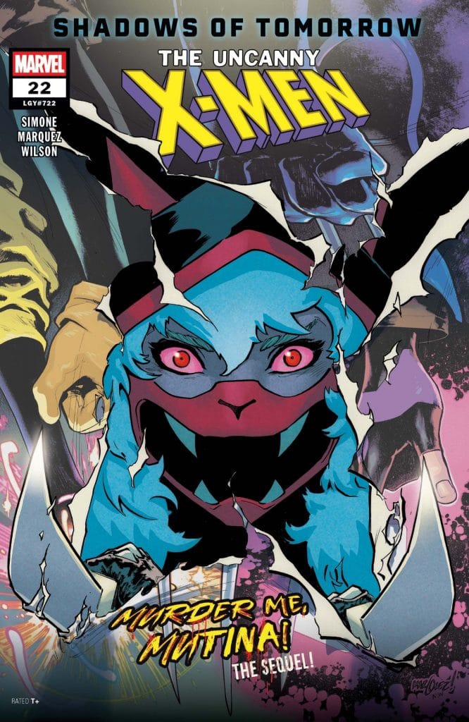
At this point, our Comic of the Week reviews aren’t exactly weekly, but our schedule slippage doesn’t mean there’s a lack of great comics out there. It just means we’re overdue to look at another top pick. So let’s catch up with the X-Men and the Outliers in “Uncanny X-Men,” written by Gail Simone, illustrated by David Marquez, and colored by Matthew Wilson.
For those who haven’t been following the latest events in the mutant side of Marvel, after the fall of Krakoa and the subsequent defeat of Orchis, the X-Men are scattered into multiple teams again. “Uncanny X-Men” follows a combination of fan favorite X-Men (Rogue, Gambit, Jubilee, Nightcrawler, and Wolverine) and their new mentees, a group of new mutants called the Outliers, as they try to make a place for themselves in Louisiana.
Issue 22 starts a new story arc, which brings back a character from an earlier story: Mutina, who is both the star of the mutant-themed horror film “Murder Me, Mutina” and a mutant with murderous tendencies herself.
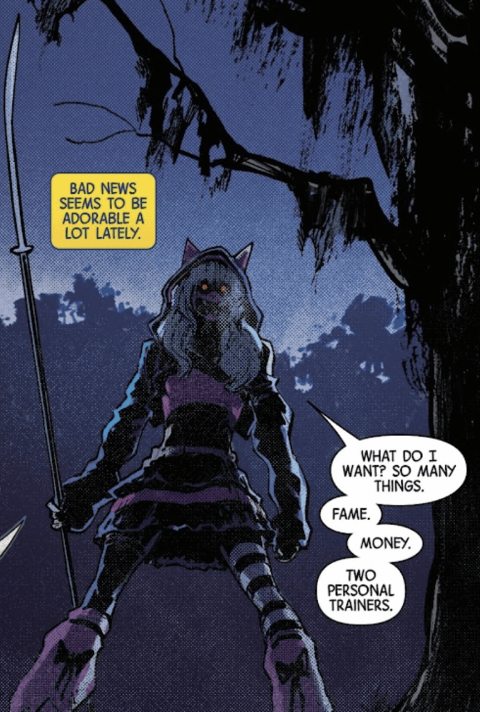
Mutina’s portrayal is an interesting blend of influencer/celebrity and sociopathic killer. She’ll go from asking to join the X-Men for the good PR to threatening everyone in nearly the same breath, taking glee as she torments her targets both physically and psychologically.
Sure, there may some people who will take issue with how a girl dressed like she’s on her way to an anime con can walk away from a fight with Wolverine, but that’s not new or surprising. Regardless, the combination of Mutina’s powers, mind games, and sheer lack of morality makes her appropriately threatening and an engaging character. (Also, her design is absolutely memorable and captures both her personality and public facing persona nicely, so I do hope to see people cosplaying her at conventions.)
Of course, that’s not all the issue is about. The story also puts a spotlight on Nightcrawler, who gets a chance to shine as the X-Men and Outliers celebrate his birthday. We get a moment to see his growing relationship with MacKenzie DeNeer (a woman whom he met after saving her daughter), how much the others appreciate him, and how he steps up when the stakes are high.
It highlights not only Kurt’s fighting skills (but absolutely takes a moment to showcase how he can wield three swords at once by using his tail) but also his heart. While Nightcrawler can absolutely take down bad guys in a fight, he’ll first try to offer a hand and a chance at redemption, and writer Gail Simone captures that heart in his dialogue and internal narration wonderfully.
So story-wise, “Uncanny X-Men” #22 is very strong, with great character moments for both a hero and villain. Now let’s look at the art.
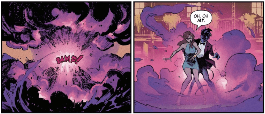
“Uncanny X-Men” is illustrated by David Marquez, with Matthew Wilson on the colors. They’ve worked on the comic alongside Simone since issue 1, and the comic is all the better for it. Marquez’s artwork brings life and personality to the characters, capturing their body language and expressions with nice subtle touches that make them feel alive. Depending on the need, the art can shift between a soft style that goes light on the details and a sharp, highly detailed close-up, adding the appropriate atmosphere to the scene.
During action scenes, Marquez uses the comic’s panels to control the pacing, alternating between different sizes and widths depending on the speed and intensity of the motion. At some points, the characters pop out of the panels, crossing over into the next just enough to carry the reader’s eyes through. That, along with the motion lines and red streaks of Mutina’s knives, keeps the fights flowing nicely from moment to moment.
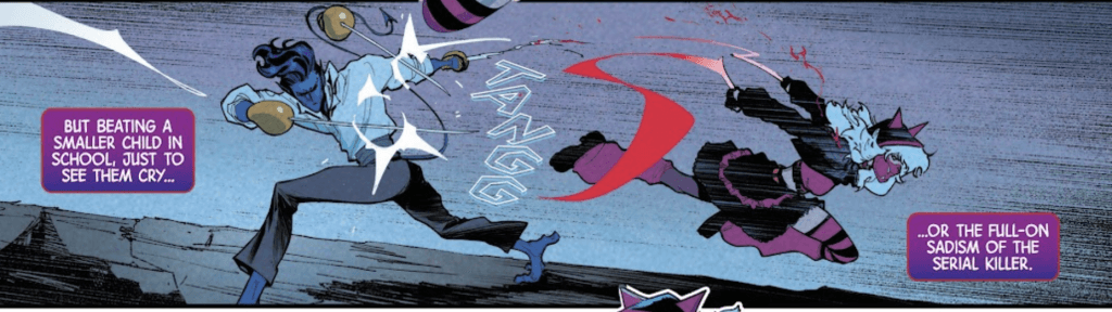
Wilson’s colors are well-suited for Marquez’s art, shifting between tones to control the mood while helping the characters stand out. In the darker scenes, Wilson strikes a great balance between the dark backgrounds, shadowed characters, and light sources to highlight the characters, keeping them in focus without compromising the atmosphere.
The use of shadows makes the colors slightly subdued, which helps them feel more natural than a more cartoonishly bright comic. It’s an appropriate choice for “Uncanny X-Men,” which often focuses on the lives, emotions, and struggles of the characters, rather than flash alone (but there is still plenty of flashy action when the moment calls for it).
If you haven’t been reading “Uncanny X-Men,” you’ve been missing out, but issue 22 is a great jumping-on point. Gail Simone, David Marquez, and Matthew Wilson are at the top of their game in every issue, bringing the character drama, development, and action readers love to see in an X-Men comic.
The post Comic of the Week: “Uncanny X-Men” #22 appeared first on G33K-HQ.
]]>The post Comic of the Week: “Deadpool/Batman” #1 appeared first on G33K-HQ.
]]>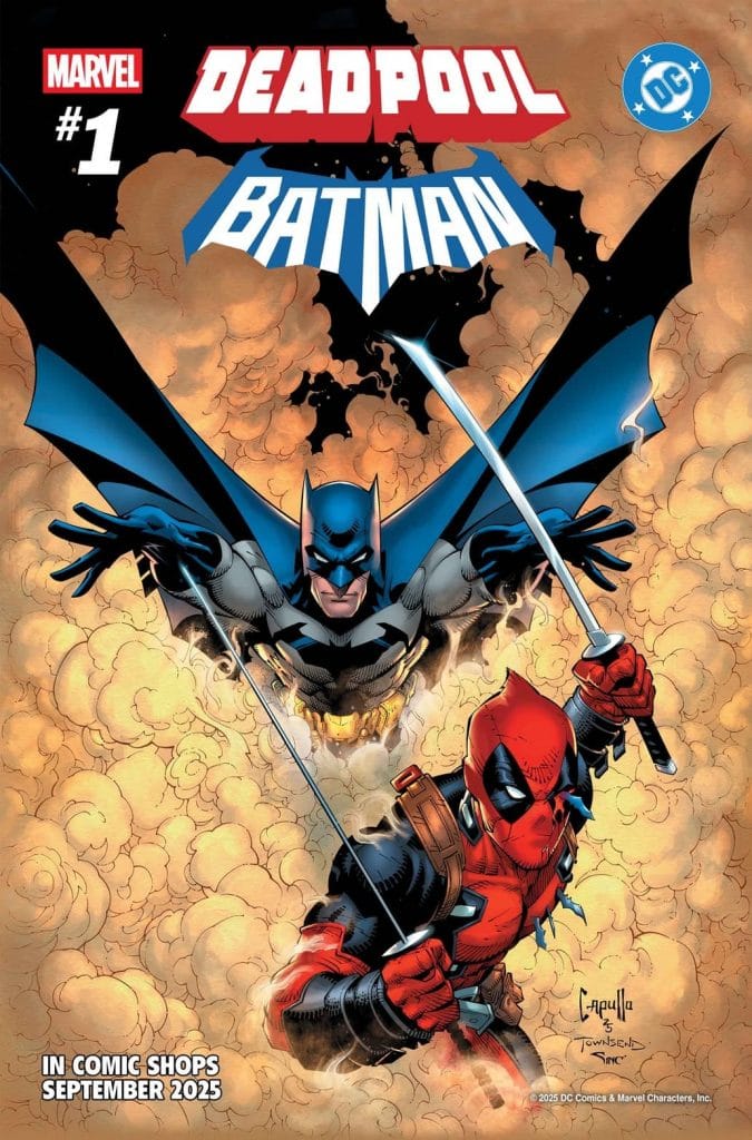
“Deadpool/Batman” #1 is written by Zeb Wells, with art by Greg Capullo, inking by Tim Townsend, and colors by Alex Sinclair. However, that’s just for the main story, as there are several smaller Marvel/DC crossover stories within the comic. These are written by Chip Zdarsky, Kelly Thompson, Kevin Smith, Al Ewing, Frank Miller, and Ryan North, and illustrated by Terry Dodson, Gurihiru, Adam Kubert (with Frank Martin on colors), Dike Ruan (with Moreno Dinisio on colors), Frank Miller again (with Alex Sinclair providing colors), and Ryan Stegman (with Frank Martin as the colorist).
In short: Marvel and DC brought in some of their bests (and also Frank Miller) to make these crossover stories happen.
Which leads to the big question: is “Deadpool/Batman” actually good?
Well, yes, absolutely. Zeb Wells captures both Batman and Deadpool nicely, creating a fun crossover that lets both of them do what they do best. It’s a fun, well-paced story, and while it doesn’t do anything unexpected or provide new insights into either character, it’s still highly entertaining the whole way through.
The story itself is pretty simple. Someone has hired Deadpool to kill Batman, they fight, they team up, there’s a sudden-but-inevitable betrayal or two, Joker’s involved, but Batman (and Deadpool, technically) win in the end. All the while, Deadpool is making snarky remarks while Batman replies in deadpan seriousness.
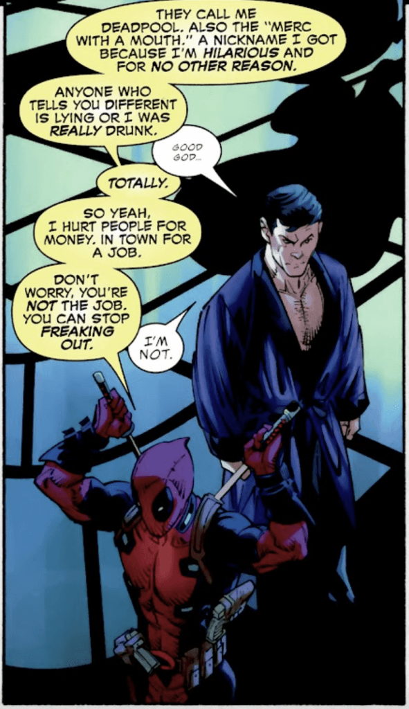
But with a one-issue crossover story, no one’s expecting anything else. We get exactly what we came for, and it’s a delight the entire time.
While it is amusing to see Deadpool’s commentary on the different aspects of Batman’s story, like the bat-signal, his young sidekicks, etc, it’s the way the characters bounce off each other that makes the comic work so well. Batman and Deadpool are pretty much opposites, so Deadpool’s nonstop banter makes Batman’s seriousness all the funnier, and vice-versa. We get similar effects when Deadpool meets Commissioner Gordon (yes, he’s no longer Commissioner in the comic canon, but this is set in a non-canonical generic point in Batman’s history). Then, when the Joker enters the picture, he and Deadpool get to go back and forth with their own distinct forms of insanity.
In short, the character work makes this comic a blast.
Of course, the artwork does plenty to make “Deadpool/Batman” work as well. Greg Capullo’s illustrations work wonders for both Batman and Deadpool, creating some fantastic scenes and showcasing both characters brilliantly.
Early on, for instance, there’s a moment where Deadpool bursts through the Wayne manor’s windows, mimicking the scene of the bat that inspired Batman. The full moon’s light illuminates the panel while casting Deadpool in shadows, making him all the more impressive while the shards of glass seem to fly off the page. Similarly, when Batman makes his entrance, it’s in a one-panel page that has Batman delivering a dramatic punch to Deadpool’s face.
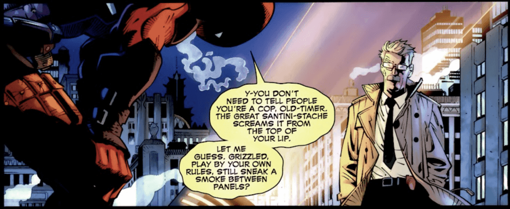
Throughout the comic, the action is fluid and dynamic, and panels are composed for optimal dramatic effect. The use of lighting and shadows works perfectly for a Batman comic, making use of the darkness without making it hard to see. Similarly, the character designs and set pieces are nicely detailed and brimming with personality, bringing every scene to life.
Alex Sinclair’s color work complements Capullo’s illustrations, adding a vibrancy to every image. Not only do the scenes with Batman make great use of shadows and lighting, but once Deadpool and the Joker get involved, the reds, greens, and purples pop off the page to make every moment easy on the eyes.
In short, this is exactly what you’d hope for from a Deadpool/Batman crossover comic. Both characters get chances to shine, they play off each other nicely, and the artwork is fantastic.
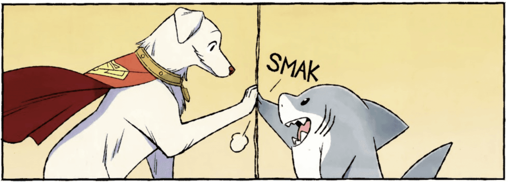
Now let’s look at the other Marvel/DC crossovers in the comic. These are smaller stories, giving us bite-sized crossovers, such as Wonder Woman and Captain America, Daredevil and Green Arrow, and a personal favorite, Krypto the Super-Dog and Jeff the Land Shark. While bite-sized, each story is fun and full of personality, giving each character a moment to shine.
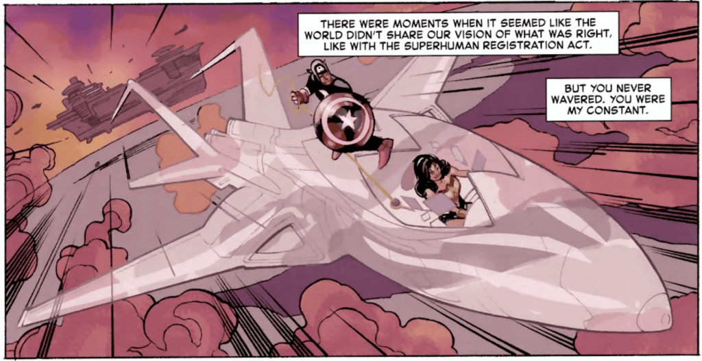
For instance, the Wonder Woman/Captain America crossover gives us a story where the Marvel and DC universes are one, and has the two meet each other in World War 2, taking us on an emotional trip through the bonds the two would build in this what-if world.
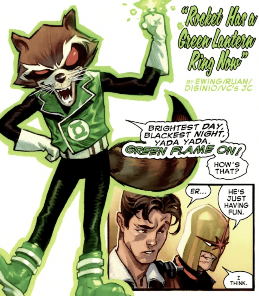
For another story, the Green Lantern/Rocket Raccoon story is short and goofy, showing the utter chaos Rocket would get up to with a Green Lantern ring. The Daredevil/Green Arrow story is filled with Kevin Smith’s clever dialogue and plenty of action, showing off the characters in action while letting them banter a bit.
Also, Frank Miller has a section where Batman and Wolverine fight too. It’s mercifully short, and is mostly just the two shouting at each other while very large sound effects cover silhouettes of them fighting, but considering the overly bulky designs we get when they’re not shrouded in darkness, I’ll take the silhouettes. Alex Sinclair’s color work remains solid, at least, adding atmosphere and some nice color effects to Miller’s illustrations, so it’s not all bad.
A personal favorite is simple but adorable: Krypto and Jeff playing ball. While that’s all there is to the story, the bright, colorful, and slightly anime-esque artwork by Gurihiru makes it a visual delight, and Kelly Thompson’s scripting leads to a well-paced story that lets both of the goodest boys in comics have fun and show off what they can do.
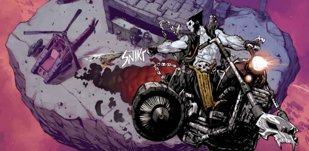
The shortest story, at only three pages, is a callback to the days of Amalgam Comics, featuring “Logo,” a combination of Wolverine and Lobo. Ryan North is a personal favorite writer, and Ryan Stegman’s artwork brings the character to life in excellent detail, so the two of them make a short but sweet introduction for a character that I wish we got more time with.
It’s rare for us to get a Marvel/DC crossover comic, so it’s worth noting and celebrating when we do, especially when it’s a great comic. “Deadpool/Batman” and all its backup stories are incredibly fun, with an all-star team of top-tier writers and artists (give or take Frank Miller, and no, I will not cut him some slack just because he wrote “The Dark Knight Returns” nearly 40 years ago). For fans of both comic companies, or even just fans of either character, this is a must-read.
The post Comic of the Week: “Deadpool/Batman” #1 appeared first on G33K-HQ.
]]>The post Comic of the Week: “Black Cat” #1 appeared first on G33K-HQ.
]]>This does mean there will be minor spoilers.
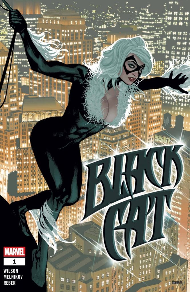
Felicia Hardy, AKA the Black Cat, is a professional cat burglar, antihero, bi icon, and on-again/off-again romantic interest of Spider-Man. However, she really gets a chance to shine when she’s headlining her own comic.
G. Willow Wilson’s run picks up to coincide with the events of the current “Amazing Spider-Man” comic, wherein Peter Parker appears to be having one of his “something went wrong and now I’m taking it out on everyone and isolating myself from my friends and family” moods, creating the perfect opportunity to focus on other characters when they’re outside of his orbit.
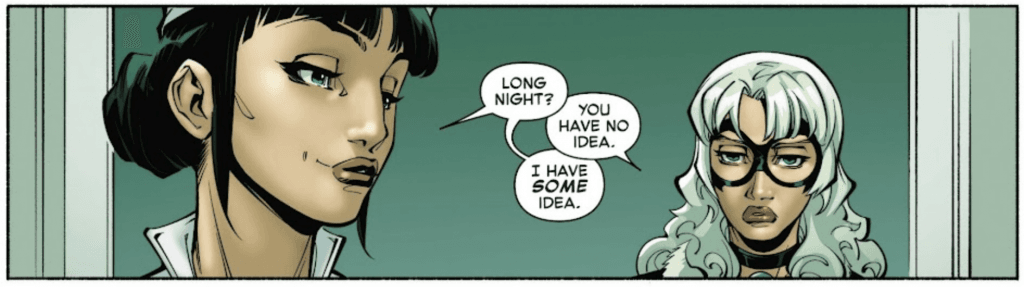
The story kicks things off in the Night Nurse’s office, creating a hook as we see what brought Felicia there on this day. It uses a fourth-wall-breaking narration to bring us back to earlier events, giving us a fun chase scene and fight that carries the story forward.
For those curious, let’s take a moment to address the fourth wall breaking. “Black Cat” #1 utilizes it as part of the narrative structure, with Felicia addressing readers directly in asides and in the box text during flashbacks. It’s not at the Deadpool level of medium awareness, instead serving to assist the storytelling and carry readers along.
The story moves at a fast pace, bringing us through the chase and subsequent fight in the first half of the book, then the cooldown and Felicia’s revelation in the latter. Her narration lets us understand her state of mind, before her conversation with the Night Nurse brings her to the idea that will kick off the comic’s plot: with Spider-Man distracted by his own problems, Black Cat has to step up and be the hero. (There you go, that’s the spoiler.)
While the comic’s setup works well as an introductory first issue, it’s the dialogue that really makes it work. Wilson does an excellent job capturing Felicia’s voice, giving her a combination of confidence, sarcasm, and professionalism that’s filled with personality. The other characters have equally strong voices, like the Night Nurse casually chatting as she treats Felicia’s wounds or Boris and Bruno helping her reach a safehouse with just a little bit of snark.
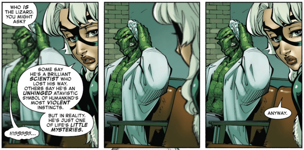
Credit should also be given to how the Lizard communicates in this issue, using hisses and growls that get translated in the text boxes.
So that makes “Black Cat” #1 enjoyable to read, but comics are as much a visual medium as anything else, so how’s the art?
Gleb Melnikov’s illustrations are lively and bold, using a nice blend of detail and just slightly exaggerated proportions to bring out key details, like musculature or facial expressions. The characters all have distinct and recognizable silhouettes and designs bursting with personality, adding to the voice and tone of every moment.
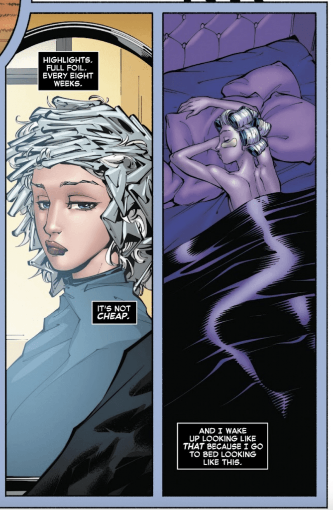
For those wondering about the fanservice, yes, Black Cat’s costume does show plenty of cleavage, and she gets a bath scene on one page. It’s tastefully done, though, and the following page goes into the work Felicia does to maintain her iconic style, giving us a look at her inner workings (not just her outer appearance).
Melnikov captures the action scenes nicely, relying on dynamic posing without too many action lines to show the characters in motion. This helps the characters stand out throughout each panel, keeping each moment clean and crisp. The sound effects add a lot to the action, especially when they use large outlines of the effects to emphasize the impact without obscuring the artwork.
Additionally, Melnikov does a great job with the scenery, bringing the city to life with a lively minimart, graffiti’d walls, and busy streets. It makes the world feel alive without making the pages cluttered or distracting from the characters, and when the backgrounds vanish, it’s to help the readers focus on the characters and action.
If I had to critique one thing about the art, it’s how the larger facial features, while adding to the expressiveness, can throw off the faces just a little. However, that’s a minor criticism and an understandable stylistic choice that brings out more of the characters’ thoughts and feelings.
Then we have the colors by Brian Reber. Reber’s color work is bright and eye-catching, but he adjusts the color scheme and tinting to match the mood and scenery. While the outdoor scenes use bright, natural colors, the world is cast in red from the lights outside Felicia’s safehouse when she’s inside, while the Night Nurse’s office turns the world a shade of blue/green to capture the atmosphere. It’s an effective use of colors to control the mood and differentiate the locations.
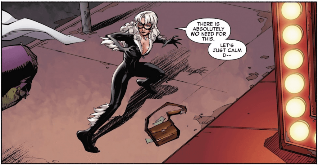
Overall, “Black Cat” #1 is off to a great start, kicking off a new chapter of Felicia Hardy’s misadventures and road to heroism. It’s fun, fast-paced, and yes, sexy when it wants to be, with great writing and solid artwork on every page. The story builds on the ongoing events of “Amazing Spider-Man” while standing on its own, so it’s safe to say that fans of the character won’t be disappointed.
The post Comic of the Week: “Black Cat” #1 appeared first on G33K-HQ.
]]>The post Comic of the Week: “X-Men: Age of Revelation” #0 appeared first on G33K-HQ.
]]>
(Yes, it’s been a few weeks since our last one. I know, I’m sorry, but comics are great and you should read them even when we don’t pick one to highlight.)
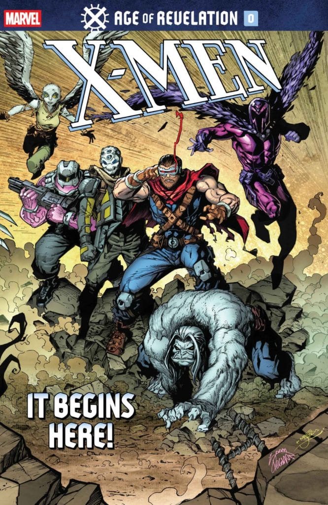
“X-Men: Age of Revelation” #0 is written by Jed MacKay, illustrated by Humberto Ramos (with Victor Olazaba inking), and colored by Edgar Delgado. This comic serves as the introduction to the upcoming X-event, but readers will still need a little context going in — mostly how Doug Ramsey, the X-Man known as Cypher, was named the heir to Apocalypse and reborn as Revelation. Now, he has to carry on Apocalypse’s mission and ensure that the mutants come out on top of “survival of the fittest,” hopefully with a bit more humanity than Apocalypse did.
As we can see from this issue, that last part didn’t go quite as hoped.
“X-Men: Age of Revelation” #0 is told mostly through flashback and narration, as Xorn provides an overview of how the Age of Revelation came to be. While it covers a good length of time, writer Jed MacKay still paces the narration nicely, letting the key moments build up even with minimal dialogue. This takes us through the key moments we, as readers, need to know even without taking a full issue to show events like the Cortez rescue mission.
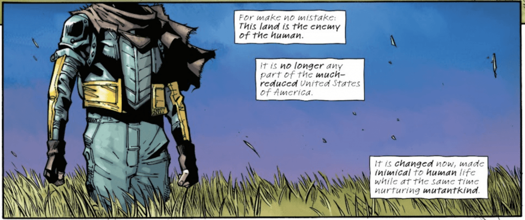
As this issue is meant to establish the story and events leading up to the latest “bad future” for the X-Men to fix (something that does tend to happen with relative frequency to the merry band of mutants), we get to see as Revelation slowly pushes and then crosses the line. It takes us through time as his best intentions become twisted, his attempts to build a new Krakoa take a turn for the worse, and events cross the point of no return. In 20 pages, it effectively lays all the groundwork for the event and sets the stakes for all of mutantkind.
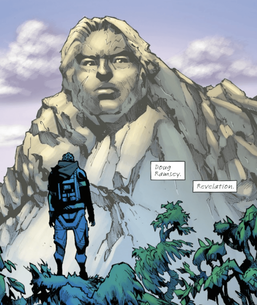
So, narratively, the comic serves its purpose nicely. Xorn’s narration carries us through all the key events, shows us Cypher/Revelation’s fall from grace, establishes the current dark future, and sets up how the X-Men will try to fix it.
Now let’s talk art. Humberto Ramos is an experienced artist, whose style utilizes a ton of detail in the scenery and characters alike. We can see this in action throughout the issue, like when Xorn walks through a crowded street filled with distinct mutant designs and built into the wreckage of a crashed helicarrier. Not only are the characters all unique and feature creative designs, but the wreckage receives just as much attention, covered in cracks and rubble. It makes each page filled with activity and scenery to take in, and each character stands out.
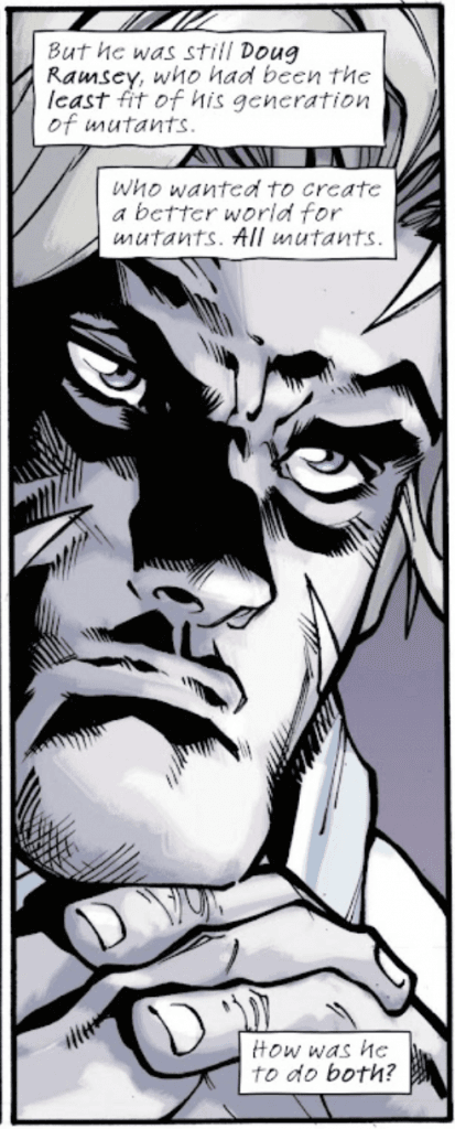
However, there are some areas where that style is not my favorite. Many of the characters, for instance, can get overloaded with muscles, shadows, and hatching, in addition to overly-large facial expressions. That does not detract from the rest of the comic’s art, but it is noticeable in several pages. (As always, of course, these critiques are a matter of personal taste, and not an indictment of Ramos’ skill as an artist.)
As MacKay’s writing carries the pacing and narrative, Ramos’ artwork serves the same purpose. He takes us through each scene, using panel size and spacing to emphasize key moments and control the flow of the story. We often get large panels that take up 2/3 of a page or more to signify the importance of a scene, or to serve as establishing shots. This helps each moment sink in and draw the reader through, bringing excellent visual storytelling to accompany the narration.
Edgar Delgado’s color work is strong, bringing distinct tinting to each part of the flashback. The colors are more subdued when it cuts to the past, but whenever it cuts back to the present, the brighter shades return to bring us back into the moment. The colors emphasize Ramos’ style and help the details pop further, while bringing characters into the foreground and influencing the atmosphere.
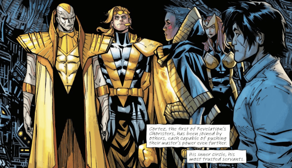
Overall, “X-Men: Age of Revelation” #0 sets up the event nicely, creating a good jumping-on point for readers with a strong narrative flow and solid artwork that introduces us to this new future. “Age of Revelation” begins in October, and will be accompanied by multiple tie-in comics with titles that will get readers excited for what’s to come (I’m personally curious about “Undead-Pool” and “Radioactive Spider-Man”). Until then, this issue serves as a nice hook for the X-event to come.
The post Comic of the Week: “X-Men: Age of Revelation” #0 appeared first on G33K-HQ.
]]>The post Comic of the Week: “Jeff the Land Shark” #1 appeared first on G33K-HQ.
]]>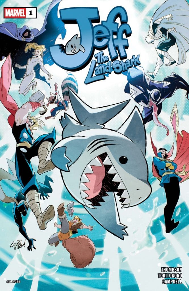
“Jeff the Land Shark” is written by Kelly Thompson, who first blessed the pages of Marvel Comics with everyone’s favorite land shark. It’s illustrated by Tokitokoro, with colors by Jim Campbell, and its main cover is drawn by Gurihiru (with several alternate covers from different artists available).
So, what exactly is the plot of “Jeff the Land Shark?” While digital comics like “It’s Jeff” give us snapshots of Jeff’s life as he travels around the Marvel Universe, having fun and maybe getting into trouble, “Jeff the Land Shark” takes that idea and turns one of his escapades into a full story. In this case, it begins with Jeff sneaking into Dr. Strange’s Sanctum Sanctorum, and the plot is driven by the consequences that follow.
After Jeff’s mischief makes him the target of a shadow demon, he’s got to chase down the fiend to recover his shadow before it’s too late. So it’s pretty low-stakes as far as comic stories go, but still a personal stake for Jeff, and it gives readers a reason to follow him as he chases his stolen shadow across the Marvel Universe.
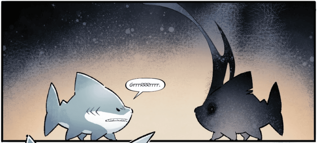
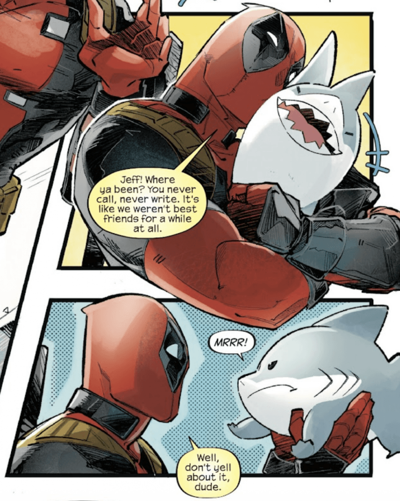
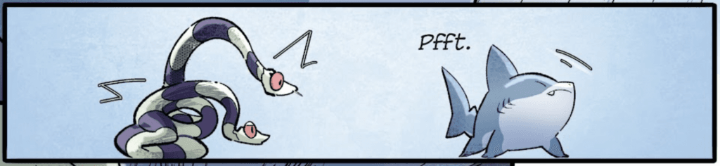
This comic also differentiates itself from “It’s Jeff” by giving characters dialogue (outside of Jeff, of course, who continues to communicate in “mrrrs,” “grrrs,” and “pffts”), rather than relying solely on visual storytelling. This allows writer Kelly Thompson to provide snarky commentary and a bit of exposition from characters like Anton and Aleister (two ghostly snakes that inhabit the Sanctum Sanctorum), as well as plenty of chatter from Deadpool. This keeps the comic’s atmosphere light and helps the story flow while giving Jeff other characters to bounce off of.
Of course, that’s not to say the visuals take a backseat, as most of Jeff’s adventure is shown through the artwork. As a non-speaking character, Jeff’s expressions and body language are essential for portraying his thoughts and personality.
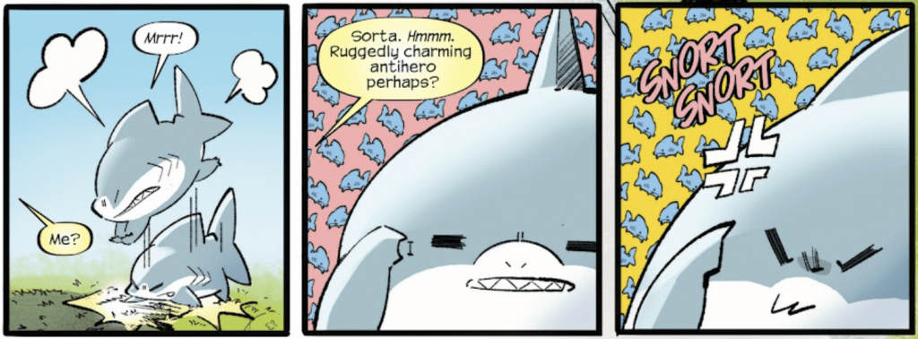
Artist Tokitokoro does an excellent job of setting the atmosphere of the comic and bringing Jeff’s personality out through the artwork. The character design leans more toward the adorable aspects of Jeff, making him more round and with a bit of an anime style to his expressions, which makes it all the more enjoyable. Tokitoro’s style leans to the cartoonish side, which works perfectly for the character and comic, and still captures the human character designs nicely.
Additionally, Tokitokoro’s artwork makes full use of panel sizing and spacing to control the flow of the comic. The panels are positioned and adjusted to move with the action on the page, like when a bouncing basket is captured in motion by tilting the panels it flies through, or a tilting table flips from one panel to another. While this can make the scenes hectic (and therefore a little harder to follow) at first glance, the way they contribute to the storytelling becomes clear and impactful when viewing each page as a whole.
Jim Campbell’s colors complement Tokitokoro’s artwork wonderfully, adding cheery bright colors to the already cartoon-like art. There’s just enough variety in the lighting and shadows to add volume to the characters, while maintaining the light shades and bright colors throughout the issue. It keeps the atmosphere light and joyful, while making every page visually engaging, especially when we get little colorful alterations to the backgrounds.
Campbell’s color work also brings out the shadows further, letting the grey and black contrast with the overall lightness of the setting without compromising the tone.
Whether you’ve been a fan of Jeff the Land Shark since he first appeared in “West Coast Avengers” or a new fan who uses him as your Marvel Rivals main, “Jeff the Land Shark” #1 is an absolute delight. Kelly Thompson is in top form, bringing us all the mischief and mayhem we’ve come to expect from Jeff in a fun-to-follow story, while Tokitokoro’s artwork and Jim Campbell’s colors bring it to life delightfully. The visual and narrative storytelling are top-notch, and it’s a purely fun comic to read.
If you like entertaining, lighthearted comics with clever dialogue, delightful visuals, and a fun cast, you’ll love “Jeff the Land Shark.” And if you don’t… then I’m sorry someone hurt you so badly.
The post Comic of the Week: “Jeff the Land Shark” #1 appeared first on G33K-HQ.
]]>The post Comic of the Week: “Imperial” #1 appeared first on G33K-HQ.
]]>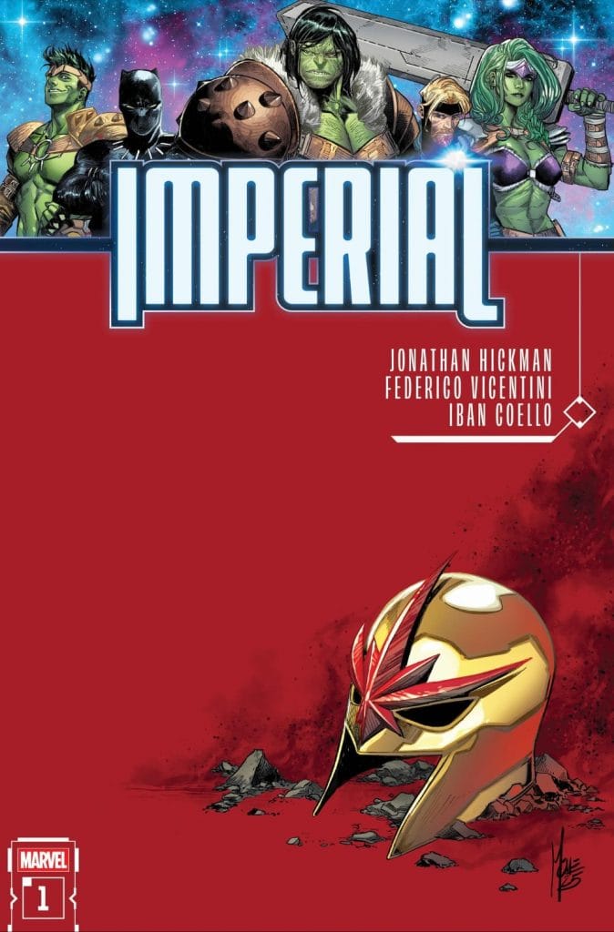
“Imperial” #1 serves as the introduction to the event, but the issue still hits us with multiple events that will have a significant impact on Marvel’s cosmic heroes (and also the Hulks). Like many comics of great importance, we begin with powerful cosmic forces playing a game, the sheer scope and consequences of which we’ll see play out as the event unfolds.
The comic is split into several parts, carrying on the story while moving the focus between a few key characters. While most of them are familiar to anyone who enjoys following spacefaring heroes, like Nova or the Guardians of the Galaxy, we still start with three Hulks (Bruce Banner, Jennifer Walters, and Amadeus Cho), providing a more familiar point of entry for readers who might not be up to date with the latest cosmic events.
Of course, this is tied up in Hulk history and lore, as they travel to Sakaar En Nevo for the funeral of Hulk’s son, Hiro-Kala. If none of those names sound familiar to you, that’s okay — it serves its purpose of bringing the Hulk into events and introducing readers to the ongoing events. From there, writer Jonathan Hickman takes us deep into galactic politics, where we’re shown the greater mystery and conspiracy in progress as well as bringing Star-Lord and Nova into the mix.
This issue takes its time setting the pace and introducing all the plot elements that need to come together while building the mystery and the political tension before upping the stakes and kicking off the first major conflict of “Imperial.” In doing so, it allows us to get reintroduced to the characters and the fragile political state of the cosmos, including key elements like Hulkling’s role as the king of the Kree-Skrull Empire, the spacefaring Wakandans, and Star Lord’s family. There’s a lot to take in, but Hickman introduces them all at a measured pace so readers who might not have learned about, for instance, Hulk’s kids or the Wakanda in space can absorb it all.
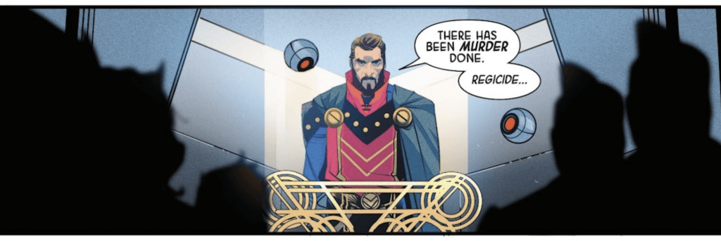
“Imperial” #1 boasts two artists: Iban Coello and Federico Vicentini. While the two have noticeably different styles, they each bring their unique strengths to the comic.
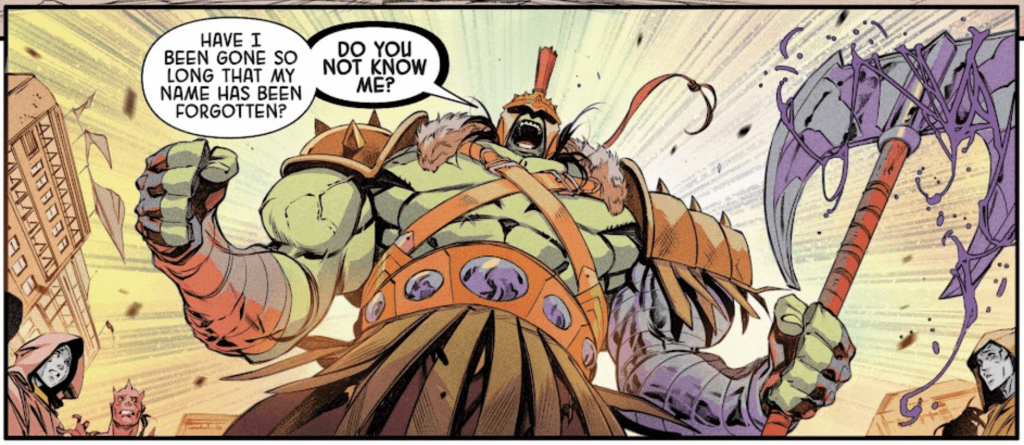
Iban Coello’s artwork features detailed designs with strong definitions and clear volume. Each character, whether human, Hulk, or alien, has a unique and consistent silhouette, complete with eye-catching outfits. For instance, the Hulk in his Worldbreaker armor strikes an imposing form, with shading that highlights each of his many muscles and rippling veins, whereas Brawn (Amadeus Cho) strikes a leaner but no less intimidating form, with an equally impressive but distinct armor set.
Other aliens are given impressively inhuman designs that remain expressive and detailed, such as how a nine-eyed alien’s brows furrow as it speaks, or how Hiro-Kala’s former wives each have distinct features they share with their children.
The same praise can be said for the rest of Coello’s art. The backgrounds in Sakaar En Nevo immediately set the tone for the planet, and are overflowing with details and touches that make the world feel alive. Meanwhile, the action pieces are filled with dynamic motion and huge impacts, and the crowd scenes feature a wide array of alien designs.
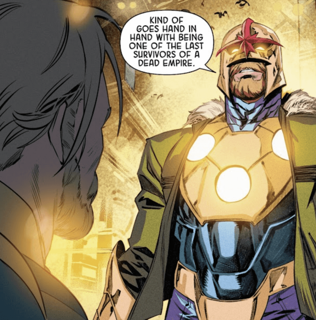
Federico Vicentini’s style is different, with more rough and jagged character designs that rely on sharp lines. The character designs aren’t quite as distinct (I’ll be honest, the only real difference between Nova and Star-Lord is their hair colors), and the proportions and expressions can feel a bit off.
However, Vicentini is also a master of composition. The way the characters and action are placed in each panel provides excellent visual storytelling, including excellent uses of reflections, framing, and body language.
Vicentini’s panels are also filled with motion and detail, making the crowded set pieces feel all the more active. One of the best panels in the comic is a two-page splash featuring J’Son (King of Spartax and Star Lord’s father) addressing a crowded meeting of alien diplomats and rulers, filled with distinct shapes, sizes, armor, and colors. The action scenes are packed with movement and characters, made all the more hectic by the size and spacing of the panels.
So while I have some critiques about Vicentini’s style when it comes to characters, his skill and talent cannot be denied.
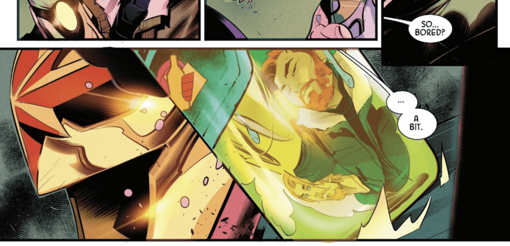
The different art styles are brought together by Federico Blee’s color work, which brings out the strengths of each artist. The colors are more subdued, often with yellow or blue-tinted backgrounds casting a pale light across the page, but it still helps the characters pop and makes the worlds feel alive. The lighting and shading add volume to each image, enhancing every moment.
“Imperial” #1 kicks off the next big cosmic event in the Marvel universe, filled with tension, intrigue, and action. Whenever a comic has Jonathan Hickman’s name on the cover, you know it’s going to reshape the Marvel universe, and “Imperial” promises to do the same for the cosmic side. Add in two talented artists and a skilled colorist, and you have a recipe for a great comic.
The post Comic of the Week: “Imperial” #1 appeared first on G33K-HQ.
]]>